Your company’s logo is the face of your business and the first impression of your company that most people see. Because of this, logos are very important but what’s in a logo? When working on logo design or logo redesign for your company, there are really just three categories to choose from: text logos, symbol logos, and combination logos. Each category has their own uses, pros, and cons but sometimes it can be hard to decide what is best for your company.
Text Logos
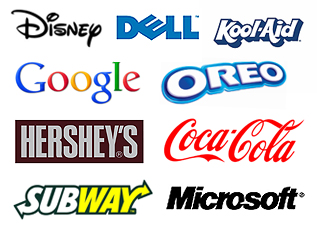
 A text logo, commonly known in the design industry as a “word mark”, is a logo made up of the text of the company’s name uniquely styled with specifics fonts. The text is sometimes tweaked with graphic elements such as lines, borders, or gradients, but those elements are minor additions to the text of the logo.
When to use a text logo:
- If your company has a name that is unique enough to make the logo memorable without adding symbols or icons.
- If your company offers many different services or products that can’t easily be combined into a single symbol. The more symbols that are added to a logo, the harder it is to make it memorable.
- If your company’s name includes many words that can’t be easily shortened or abbreviated. If you have many words to include in your logo, purely using text for the logo can help keep it clean and uncluttered.
Symbol Logos
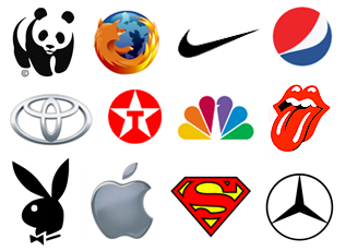
 A symbol logo is just the opposite of a text logo- it includes no text but instead is made up of symbols and shapes. Symbols aren’t as direct as straight text but that also leaves room for individual interpretations of what the symbol can represent.
When to use a symbol logo:
- If your company has a worldwide presence and you can create a symbol that defines your company without words. Symbols can cross language barriers but only if they’re recognizable.
- If your company’s branding is already easily recognizable, a simple symbol can be a cleaner alternative to a combination logo. If your company is just starting out, a single symbol could be hard for new customers to remember or understand.
- If your company has been using a combination logo and you’ve created enough brand recognition around your company to drop the text in your logo. This combination-to-symbol logo evolution is quite common as companies grow to be large and recognizable.
Combination Logos
 A combination logo is the best of both worlds, combining the use of text and symbols to give a clear message that’s also aesthetically pleasing to the eye. The text can be integrated into the symbol or stand alone beside or beneath the symbol. Combination logos are the most common type of logo.
When to use a combination logo:
- If your company doesn’t have the brand recognition to carry a single symbol but you want more than text in your logo. Combination logos can be easily converted into a symbol logo when a company grows large enough.
- If your company wants to make customer think of your business name when they see a certain symbol.
- If your company wants to copyright your logo with ease. Combination logos are easier to copyright because the symbol will always be used with the company name.
What Do You Think?
What do you think about logos? Does your company have a text, symbol, or combination logo? What are some of your favorite or most memorable logos? Please share with us in the comments!


