
Articles
-

Why Unmanaged Google Ads Accounts Quietly Waste Utah Budgets
The strange thing about Google Ads waste is that it is invisible. The account runs. The monthly report shows clicks and impressions. Money leaves the bank account on schedule, some leads come in, and everything appears to be working. Most business owners have never seen what a professionally managed account looks like next to their…
-

What Should PPC Management Actually Include? A Checklist for Utah Businesses
If you are paying for PPC management — or deciding whether to — there is a question you deserve a concrete answer to: what exactly does that money buy every month? Most business owners cannot answer it, and that is not their fault. The work happens inside an account they rarely open, described in language…
-

How Much Does a Custom Website Cost in Utah? An Honest Breakdown
It is the first question almost every business owner types into Google before contacting anyone: how much does a website cost? And the answers out there are almost uniformly frustrating. The DIY platforms tell you sixteen dollars a month. The agency websites tell you “it depends” and ask you to book a call. Neither answer…
-
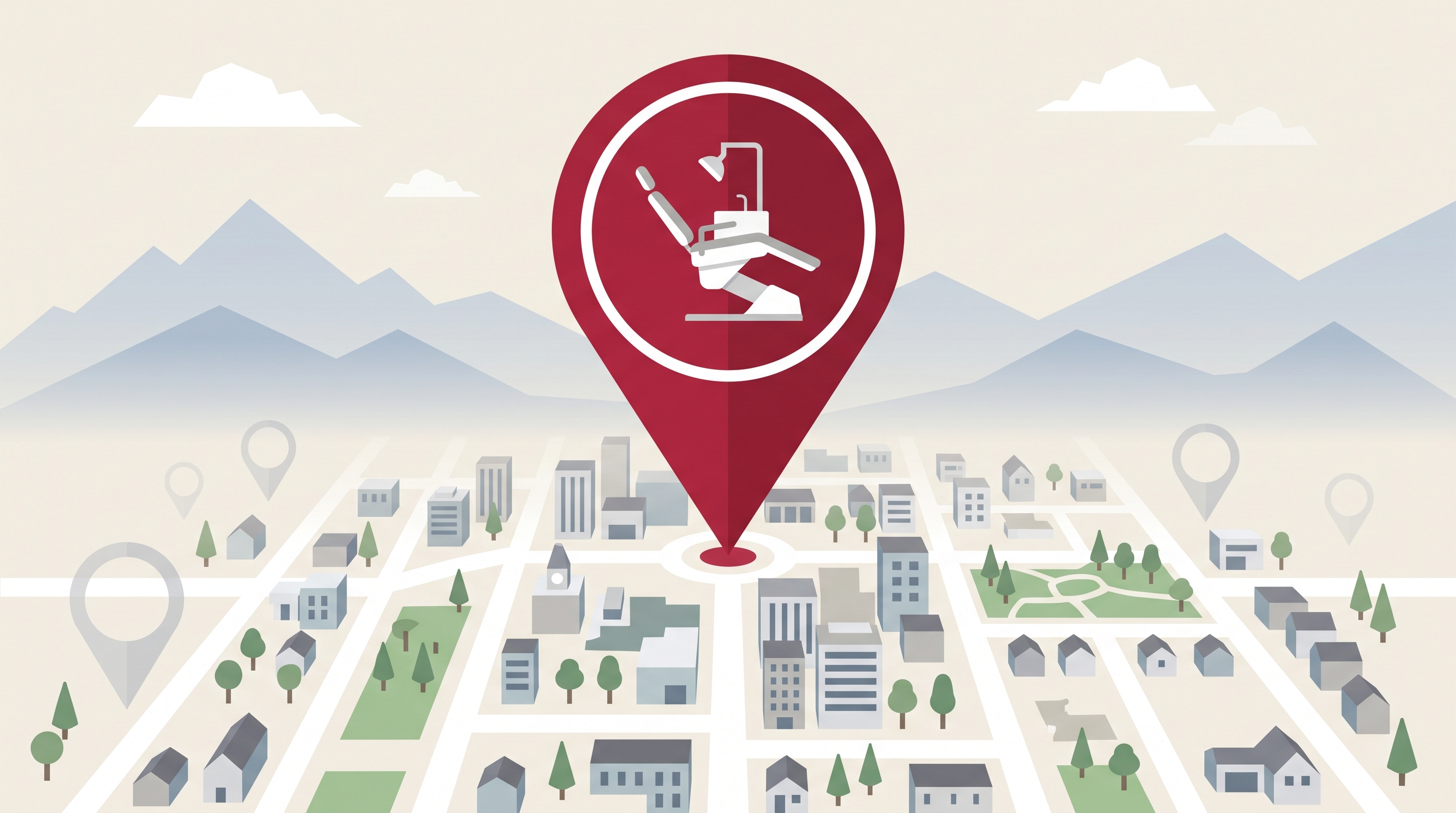
Dental SEO in Utah: How Utah County Practices Win New Patients From Search
Utah County has one of the highest concentrations of dental practices per capita in the country. Drive through Orem, Provo, or Lehi and you can pass a dozen practices in ten minutes — general dentists, pediatric specialists, orthodontists, implant centers, and the fast-growing corporate groups, all serving the same fast-growing population. For patients, that density…
-

Why Businesses Often Fix the Wrong Problem First
When business slows down, most owners do what they have always done: they look for the problem. That sounds reasonable. In fact, it is exactly what they should do. The challenge is that many businesses do not actually identify the problem. They identify the symptom. And symptoms have a way of pointing people in the…
-

Why Some Businesses Get More Calls Without Getting More Traffic
One of the most common assumptions in marketing is that more traffic leads to more business. More visitors, more clicks, more impressions, more exposure. It sounds logical, and sometimes it is true. But after more than 25 years of working with Utah businesses, we have noticed something interesting: some companies increase their inquiries without significantly…

Build Your Growth with Infogenix
Your digital presence should not be a static placeholder—it should be your strongest marketing asset. At Infogenix, we combine marketing expertise, creative design, and robust development to help your business thrive.
Whether you need SEO to grow visibility, advertising to generate leads, or a website that sells for you, our team has the experience and vision to make it happen.
Ready to take your marketing to the next level?
Contact Infogenix today for a free consultation and discover how we can help you achieve your digital goals.
Whether you need SEO to grow visibility, advertising to generate leads, or a website that sells for you, our team has the experience and vision to make it happen.

Infogenix has been with our company since the beginning. They created our first, second and third website. They simply deliver excellent results and we count on them to help us get our businesses online. I rely on Infogenix on for SEO, graphic design, web development, hosting and promotions
Zarbee’s Naturals
After interviewing several firms, we contracted Infogenix for a project with a very short development window. They delivered on time, and what started as a relatively small two-month project has turned into a continuous relationship of over three years now. They consistently deliver to our specs and support both our engineering and design needs which are oftentimes complicated. We’ve been happy to work with a dedicated firm that has dedicated a lot of energy and thought into our growing business.
Campus Book Rentals
“Infogenix has designed our site and helped us create a brand in a way that is compelling and drives business. Web traffic is only important to us if we get clients – Infogenix has created our site in a way that converts web traffic into customers.”
Red Frog Beach
“Infogenix was able to create our website in a way that not only delivers all of the features we were looking for, but also matches the look and feel of our facilities.”
Hotel Park City
“Infogenix is an incredible company that does amazing work. My experience with Infogenix started when I asked them to create a design for me (from scratch) with an impossible deadline. I gave them an example of what I wanted, with my ideas, and the ‘feel’ I wanted it to have, and they came back WITHIN THE DAY with a design that blew my mind! It was far better then what I was expecting! As for the impossible deadline…. it was met! These guys are unreal! I will never use anyone else.”
Health Fusion
“Infogenix always makes meeting our needs and expectations their top priority. They were able to meet strict guidelines and give us the best website possible.”
Central Bank
“Having worked with Infogenix for more than five years on various web design and programming projects, I remain very impressed with the quality of work, professional attitudes and personalized service provided. I would not hesitate to recommend Infogenix for any web design related endeavor.”
Intermountain Life Flight
“It was important that our site stand out not only visually, but in the scope of features available as well. Infogenix delivered on both fronts, creating an attractive website with more features and details than similar websites. They’ve stayed with us, as well, to make sure we always stay competitive.”
ClassG
“I am a recording artist who has been thrilled with the services of Infogenix. Since 2000, Infogenix has been instrumental in the design and implementation of 4 different web designs, for my 9 page website. They have always been professional, thorough, attentive and quick to meet any of my needs, for all aspects, of my site.”
Anne Cochran