Custom Website Design That Reflects Your Brand and Engages Users
At Infogenix, website design is more than just aesthetics. It is about crafting a seamless, strategic experience that engages your visitors and turns them into customers. With over 25 years of experience building websites from the ground up, our team combines design, usability, and technical precision to deliver websites that not only look great but also work flawlessly across all devices.
Whether you’re launching a new business or refreshing your existing digital presence, our custom web design services are tailored to help you stand out in a crowded online space. Every website we create is unique, mobile responsive, and built with user experience and long-term maintainability in mind.
Our Web Design Philosophy: Build With Purpose
We believe that good design isn’t just visual. It solves problems. From the first discovery call to post-launch support, our process ensures that every element of your site, including layout, typography, color, and content structure, is intentional, aligned with your brand, and focused on the user.
Your website is often the first interaction a potential client has with your business. It should inspire confidence, communicate clearly, and guide users toward action. That is why our designers and developers work together to create fast, functional, and visually compelling websites that reflect the heart of your brand.


End-to-End Website Design Solutions
We offer a complete suite of website design and development services with a primary focus on building high-quality, user-friendly websites.
What We Offer
Custom Website Design
Every website starts from scratch. We never use templates or shortcuts. Your site is designed around your goals, your audience, and your brand identity.
Responsive Web Design
Your site will adapt seamlessly to all screen sizes, including desktop, tablet, and mobile, ensuring consistent usability and performance.
UX and UI Design
We create intuitive navigation, page flows, and interactive elements that improve user experience and encourage engagement.
Frontend and Backend Development
Once designs are approved, our developers implement them using clean, efficient code that ensures strong performance, security, and flexibility.
Accessibility and Performance Optimization
We adhere to best practices in accessibility and speed, ensuring your website is usable by all audiences and loads quickly.
Content Design and Strategy
Clear and well-structured content supports both usability and SEO. We help you organize your messaging to work seamlessly within the design.

Need branding, a logo, or print design?
We offer logo creation and brand identity design services to ensure a cohesive look, included as part of your broader web design project. We also do print design projects.
Let’s talk!
Our Process: From Discovery to Launch
Creating a high-performing website requires a strategic and proven process. Our method guides you from concept to completion with clear communication at every stage.
Discovery
and Planning
1.
We begin by learning about your goals, target audience, and technical needs. This phase includes site architecture planning, content review, and alignment on timeline and budget.


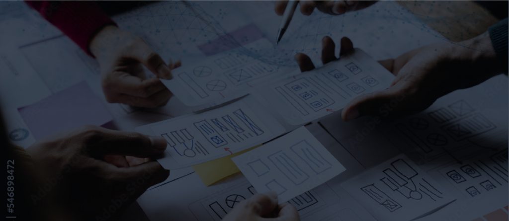
Wireframing and Designs
2.
We create wireframes that define the structure of your website. These layouts show how users will navigate, how content will be grouped, and how interactions will function across devices.
Our designers produce unique visual mockups for your homepage and key internal pages.
3.
Once the design proofs are approved, our developers code the website in a private staging environment. We build fully responsive pages that work seamlessly across browsers and screen sizes. You can view progress in real time and provide feedback throughout.

Development and Responsiveness
Quality Assurance and Testing
4.
We run extensive testing to ensure the site works across all major browsers and devices. This includes speed optimization, mobile performance, functionality checks, and SEO readiness.

5.
After final approval, we assist with the deployment of your new website. When you are ready to launch, we offer hosting services, and support & maintenance options to keep your site secure and up to date.
We have an experienced SEO Marketing Team that can help draw traffic to your website.

Launch and Support
We have an experienced SEO Marketing Team
that can help draw traffic to your website.
 See our SEO page for more details.
Designed for Scalability and Growth
Although our core service is web design, we understand that your website supports future growth. We build sites that are flexible and ready to scale as your business evolves. Whether you need to expand your content, add ecommerce functionality, or integrate third- party tools, your site will be prepared.
Our websites are also built with foundational SEO in mind. This includes:
- Semantic HTML and structured code
- Mobile-friendly responsive layouts
- Fast page load speeds
- Logical content hierarchy using proper heading tags
These practices help ensure that your site is not only user friendly but also search engine friendly from the start.

Let’s Design Something Great Together
Your website should support your business goals, build trust with your visitors, and provide a meaningful user experience. If you’re ready to invest in a custom site designed for performance and growth, Infogenix is ready to help.
Contact us today for a personalized web design consultation.
Let’s create a website that brings your vision to life.

Infogenix has been with our company since the beginning. They created our first, second and third website. They simply deliver excellent results and we count on them to help us get our businesses online. I rely on Infogenix on for SEO, graphic design, web development, hosting and promotions
Zarbee’s Naturals
After interviewing several firms, we contracted Infogenix for a project with a very short development window. They delivered on time, and what started as a relatively small two-month project has turned into a continuous relationship of over three years now. They consistently deliver to our specs and support both our engineering and design needs which are oftentimes complicated. We’ve been happy to work with a dedicated firm that has dedicated a lot of energy and thought into our growing business.
Campus Book Rentals
“Infogenix has designed our site and helped us create a brand in a way that is compelling and drives business. Web traffic is only important to us if we get clients – Infogenix has created our site in a way that converts web traffic into customers.”
Red Frog Beach
“Infogenix was able to create our website in a way that not only delivers all of the features we were looking for, but also matches the look and feel of our facilities.”
Hotel Park City
“Infogenix is an incredible company that does amazing work. My experience with Infogenix started when I asked them to create a design for me (from scratch) with an impossible deadline. I gave them an example of what I wanted, with my ideas, and the ‘feel’ I wanted it to have, and they came back WITHIN THE DAY with a design that blew my mind! It was far better then what I was expecting! As for the impossible deadline…. it was met! These guys are unreal! I will never use anyone else.”
Health Fusion
“Infogenix always makes meeting our needs and expectations their top priority. They were able to meet strict guidelines and give us the best website possible.”
Central Bank
“Having worked with Infogenix for more than five years on various web design and programming projects, I remain very impressed with the quality of work, professional attitudes and personalized service provided. I would not hesitate to recommend Infogenix for any web design related endeavor.”
Intermountain Life Flight
“It was important that our site stand out not only visually, but in the scope of features available as well. Infogenix delivered on both fronts, creating an attractive website with more features and details than similar websites. They’ve stayed with us, as well, to make sure we always stay competitive.”
ClassG
“I am a recording artist who has been thrilled with the services of Infogenix. Since 2000, Infogenix has been instrumental in the design and implementation of 4 different web designs, for my 9 page website. They have always been professional, thorough, attentive and quick to meet any of my needs, for all aspects, of my site.”
Anne Cochran