Your logo is the first thing most people see from your business and the thing they remember afterward. It goes on the sign, the truck, the invoice, the website header, the social profile, and the favicon in a browser tab. For something that small, it does a lot of work.
Every logo you have ever seen falls into one of three categories: text logos, symbol logos, and combination logos. Designers sometimes split those into finer groups (lettermarks, pictorial marks, abstract marks, mascots, emblems), but those are variations on the same three ideas. Once you know the three and when each one works, choosing the right type for your own business gets much simpler.
Text Logos
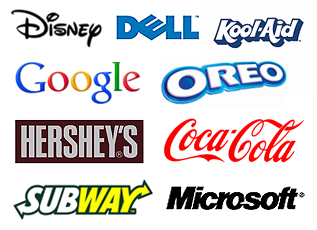 A text logo, known in the design industry as a word mark or logotype, is the company name set in a distinctive typeface and treated as the logo itself. Disney, Google, FedEx, Subway, and Dell all use text logos. Small graphic touches (a line, a border, a color change, a custom letterform) are allowed, but the words carry the design.
A close cousin is the lettermark or monogram, where a long name is reduced to its initials: IBM, HBO, CNN, NASA. Lettermarks are still text logos; they just use fewer letters.
When a text logo is the right choice:
- Your name is distinctive enough to be memorable on its own. A made up or unusual name (Google, Oreo, Etsy) is a natural fit.
- You offer many different services or products that would be hard to represent with one symbol. The more ideas a symbol tries to carry, the less memorable it becomes.
- You are new and nobody knows you yet. A text logo tells people your name every single time they see it, which is exactly what a young business needs.
- Your name is long. Setting it in type keeps the logo clean instead of cramming a picture next to several words.
The weakness of a text logo is that it depends entirely on typography and spacing. Set in a default font with no attention to letter spacing, it looks like a document header rather than a brand. The typeface is the design.
Symbol Logos
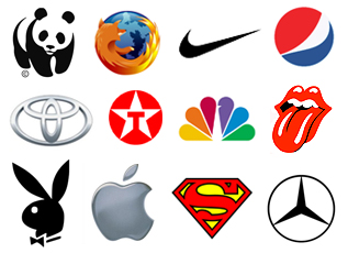 A symbol logo is the opposite of a text logo. There are no words at all, just a shape, icon, or illustration that stands for the company. Designers call this a brand mark, pictorial mark, or logomark. If you have ever searched for what a logo without words is called, that is the answer.
Symbol logos come in a few flavors. A pictorial mark is a recognizable object: the Apple apple, the Target bullseye, the Shell shell, the Twitter bird. An abstract mark is a shape that means nothing on its own until the company gives it meaning: the Nike swoosh, the Pepsi globe, the Mercedes star, the Mastercard circles. A mascot is a character: the Michelin Man, the KFC Colonel, the Pringles face.
Famous logos without words
Most of the logos people can draw from memory with no text are symbols that started out next to a company name and dropped it later. A few widely known examples:
- Apple has used the bitten apple with no text since the late 1970s.
- Nike began using the swoosh alone in the mid 1990s after two decades of pairing it with the name.
- Starbucks removed the words “Starbucks Coffee” from its ring in 2011, leaving only the siren.
- Mastercard dropped its name from the overlapping circles in 2019.
- Target, Shell, Mercedes, McDonald’s, Pepsi, Instagram, and Chanel all appear regularly with the symbol alone.
Notice what every company on that list has in common: decades of advertising and millions of customers before the words came off. The symbol works without a name because the name was already in everyone’s head.
When a symbol logo is the right choice:
- Your brand is already widely recognized and you want a cleaner mark for app icons, favicons, embroidery, and small spaces.
- You operate across languages and markets. A symbol crosses language barriers in a way text cannot, but only once people recognize it.
- You have been using a combination logo for years and customers already connect the symbol with your name. Dropping the text at that point is a natural evolution, and it is how most of the famous examples above got there.
For a new or local business, a symbol alone is usually the wrong call. A customer who sees an unfamiliar shape on a truck or a storefront has no way to know who you are or what you do. Earn the recognition first.
Combination Logos
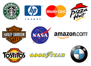 A combination logo pairs a symbol with the company name. The text can sit beside the mark, beneath it, or be woven into it. Adidas, Burger King, Lacoste, Puma, Domino’s, and Amazon all use combination logos, and so do most small and midsize businesses, because it is the most practical type by a wide margin.
An emblem is a combination logo where the text sits inside the shape, the way a badge or a crest works: BMW, Porsche, Stella Artois, and nearly every sports team. Emblems look traditional and established, which is why schools, breweries, and heritage brands like them. The tradeoff is that the text inside gets hard to read at small sizes.
When a combination logo is the right choice:
- You want a visual element but do not yet have the recognition to carry a symbol by itself. The name does the introducing while the symbol builds familiarity.
- You want flexibility. A well designed combination logo can be split apart: the full version on the website and signage, the symbol alone as a favicon or social avatar, the word mark alone on a letterhead.
- You want to teach customers to associate a shape with your name so that, years from now, the shape can stand on its own.
- You plan to register a trademark. A distinctive symbol paired with the name is easy to protect and easy to enforce, because the two always appear together.
Three questions to answer before you choose
The type of logo matters less than whether the logo says the right thing. Before any sketching starts, we ask clients three questions. A designer who skips them ends up asking “what colors do you like?” instead, and the result is decoration rather than a brand.
What is your brand, apart from the logo?
A logo is not a brand. The brand is the sum of what customers feel about you: how you answer the phone, how your trucks look, what your reviews say, how your website behaves. The logo is the symbol that stands for all of that. So the first job is to describe the brand in plain adjectives (dependable, premium, friendly, fast, local, technical) and then design a mark that embodies those words. If the adjectives are not clear, no logo type will fix it.
Who is the logo for?
The audience sets the boundaries for type, color, and how adventurous the design can be. A logo aimed at college age men buying energy drinks and a logo aimed at first time parents buying diapers should not look remotely alike, even though both might be combination logos. Knowing who has to like the logo tells you how bold, how soft, how formal, or how playful it can be.
What separates you from your competitors?
This is the narrowest and most useful question. Two shipping companies can both serve families and businesses anywhere in the world. If one of them delivers twice as fast, that difference belongs in the brand, and often in the logo. The point of differentiation is the soul of the company, and the strongest logos find a way to hint at it.
Which type is best for a small business?
For most local and regional companies, including the Utah businesses we work with, the answer is a combination logo built so that the symbol and the word mark each work alone. You get the name recognition of text while people are still learning who you are, the flexibility of a standalone symbol for small spaces, and a path toward a symbol only mark if the business grows into it.
A text logo is the right choice when the name is the asset, or when the budget and timeline are tight and a strong typographic mark will outperform a rushed symbol. A symbol only logo is a destination, not a starting point.
Whatever type you choose, insist on a logo that holds up at every size it will be used, from a billboard to a 16 pixel favicon, in full color, in one color, and in black on white. A logo that only works large and in color will fail you somewhere.
Infogenix has designed logos and brand identities for Utah companies since 1998, usually as part of a website design project where the logo, the site, and the marketing need to agree with each other from day one.
Frequently asked questions
What are the three types of logos?
Text logos (the company name set in a distinctive typeface), symbol logos (a shape or icon with no words), and combination logos (a symbol paired with the name). Lettermarks, pictorial marks, abstract marks, mascots, and emblems are all variations within those three.
What is a logo without words called?
A logo made only of a symbol is called a brand mark, pictorial mark, or logomark. If the symbol is an abstract shape rather than a recognizable object, it is an abstract mark. Apple, Nike, Target, and Shell are common examples.
What is a text only logo called?
A text only logo is a word mark or logotype. When it uses only the company’s initials, such as IBM or HBO, it is a lettermark or monogram.
Which type of logo is best for a new business?
A combination logo, designed so the name and the symbol can also be used separately. New businesses need to be named every time they are seen, and a symbol alone cannot do that until the brand is recognized.
Can I trademark my logo?
Yes. Logos are protected as trademarks, and the United States Patent and Trademark Office handles registration. A distinctive combination of symbol and name is typically the easiest to register and defend, because the elements are always used together. Talk to a trademark attorney before filing.
Need a logo that works with the rest of your marketing?
Infogenix has designed logos, brand identities, and the websites that carry them for Utah businesses since 1998. If your logo is due for a refresh or your new company needs one that will still look right in ten years, see our design services or request a quote.
Call us at 801.724.7483.