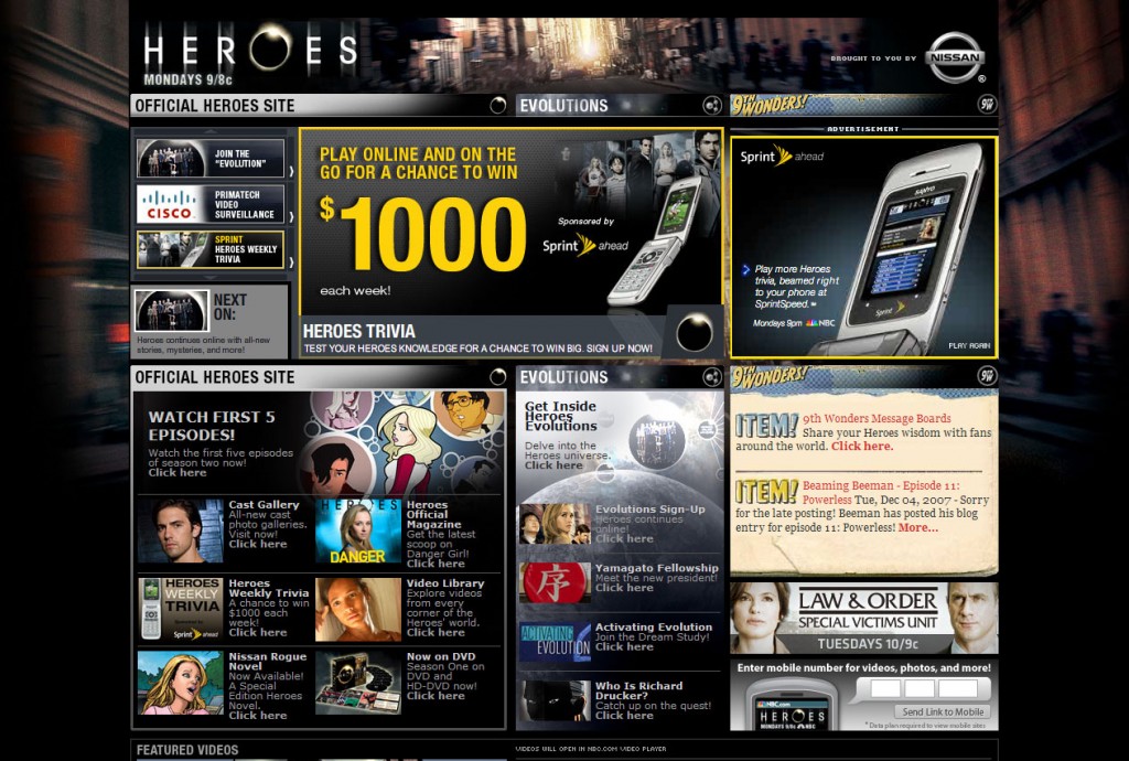
Raise your hand if you’ve ever seen an ugly website. Okay, I guess you don’t actually have to raise your hand, but I’m sure all of you would have if I could see you. This makes us wonder if there are so many bad websites, why haven’t designers stopped making them? The answer is simple really: they don’t realize they’re bad. If no one ever teaches you how to read, how can you learn? Well, the same goes for web design. Many designers want to show off their knowledge of photoshop by inserting countless styles and typefaces into a website.
Unfortunately, this leads to a cluttered, distracting appearance. Even more unfortunate is the inability to directly tell the designer what they have done wrong. With so few feedback systems being utilized by websites, designers are left high and dry to fix any mistakes by themselves. That’s why I’ve compiled this article on behalf of every upset website visitor out there. With a little luck, more than one designer will see this, realize their mistake, and begin creating beautifully designed masterpieces. Well, maybe not that far, but you get the point.
Simplicity Is Bliss
In the case of web design, simplicity beats out ignorance. You never want to distract visitors with overly colorful graphics or hard to read text. Remember that content is the most important thing on a webpage, not the design. Now this doesn’t mean you can’t have a nice, colorful website, but it does mean the colors have to be subtle. Just think of it like presenting a business presentation. You’d never try and get support for a company while wearing a neon green suit with red pinstripes, so why would your website be any different? Short answer: it’s not, and forgetting this can be the death of a site.
Use Appearance To Support An Idea
Think of design like the trusses on a bridge. Or suspension cables. Really anything that supports the bridge will work fine. The point is that a website should represent a company. If you happen to be designing a site for a law firm, you’re going to want a simple, minimalist design, whereas something like a casino would want a more colorful site to represent the bright lights and late nights so common to them. Remember that you’re trying to make a design for the target market, not you. A site explaining medicare probably shouldn’t have flashing images and bright colors, lest we scare all the old people away. The best designers can base a website around any specific audience and can make it look good, too.


